Slack reworks its interface to reorganize the sidebar and emphasize apps
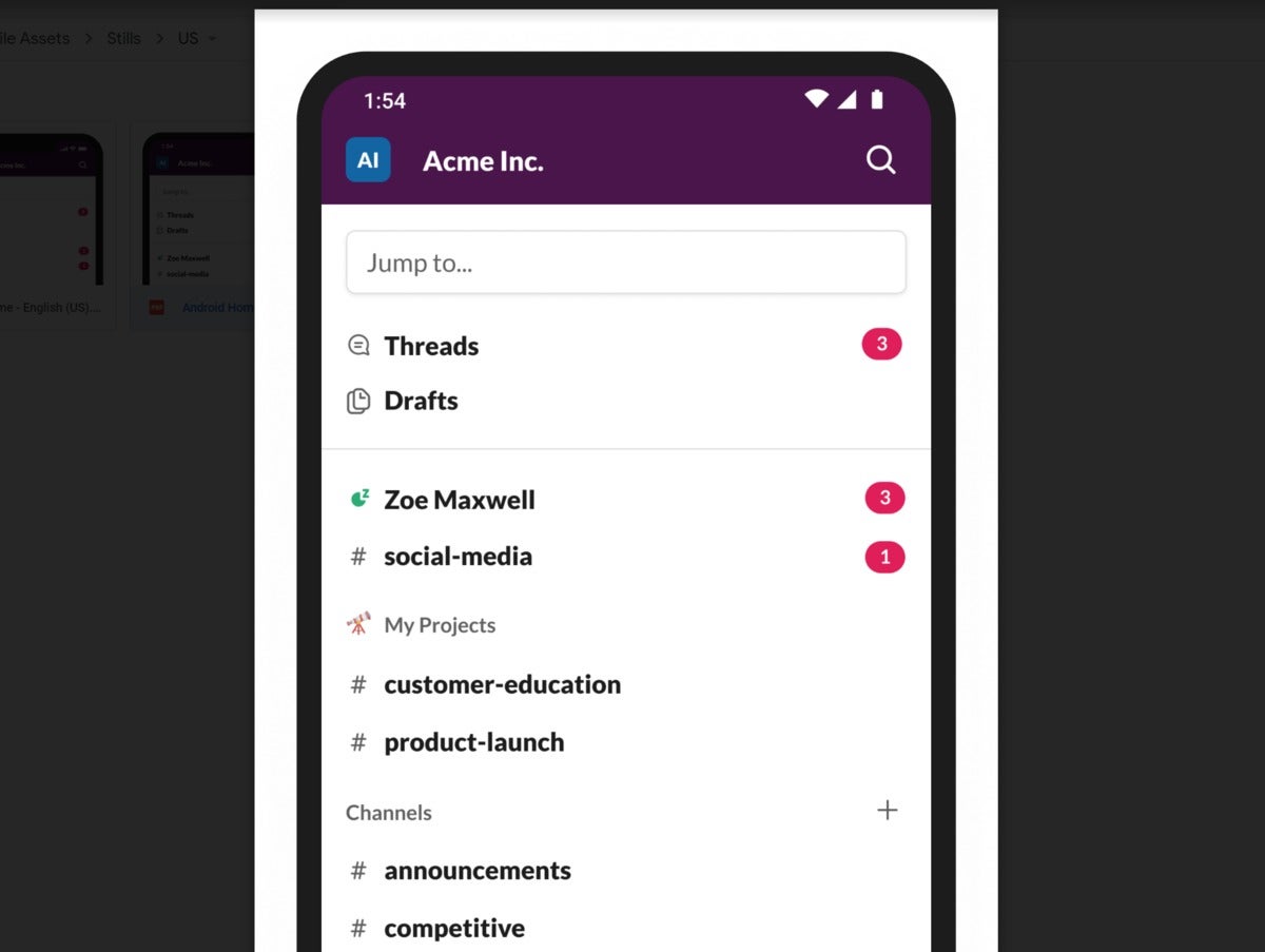
Editor's Note: Slack said Wednesday, May 13 that it's updating its iOS and Android apps to add to additional functionality there, too. Part of the interface includes the ability to swipe right to view workspaces and swipe left to view the last channel or direct message you were in. A screenshot of the mobile interface is below.
 Slack
SlackBeginning Wednesday, Slack users will receive a user interface update that allows them to reorganize the channels in the left navigation bar, along with a tweak that makes shortcuts to related apps much more prominent via a new “lightning bolt” icon.
from PCWorld https://ift.tt/3a2meKr
Labels: PCWorld

0 Comments:
Post a Comment
<< Home