Slack reworks its interface to reorganize the sidebar and emphasize apps
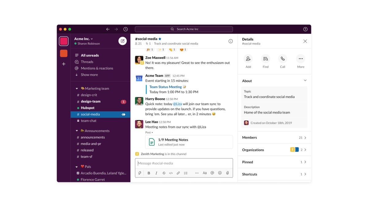
Beginning Wednesday, Slack users will receive a user interface update that allows them to reorganize the channels in the left navigation bar, along with a tweak that makes shortcuts to related apps much more prominent via a new “lightning bolt” icon.
Though Slack touts the new UI changes as “simpler,” the reality appears somewhat more complex. Slack’s UI adds more visual details than the current version, continuing Slack’s current trend of placing unfinished or “draft” messages at the top of the channel stack. Now, in addition to the “All unreads” messages option, Slack will add a “Mentions and Reactions” option, too.
 Slack
Slack
An overall view of the new Slack interface.
from PCWorld https://ift.tt/3a2meKr
Labels: PCWorld

0 Comments:
Post a Comment
<< Home